
-
Growing Pains - Art Print
Regular price From ₩43,000 KRWRegular price -
Wrath Protocol - Art Poster
Regular price From ₩43,000 KRWRegular price -
Transmission - Art Poster
Regular price From ₩43,000 KRWRegular price -
Vibrant Dreams - Surreal Art Poster
Regular price From ₩43,000 KRWRegular price₩0 KRWSale price From ₩43,000 KRW -
The Viral King - Art Poster
Regular price From ₩43,000 KRWRegular price -
Blocked - Surreal Art Poster
Regular price From ₩43,000 KRWRegular price₩0 KRWSale price From ₩43,000 KRW -
Good Vibrations - Art Poster
Regular price From ₩42,000 KRWRegular price -
Fangs - Surreal Art Poster
Regular price From ₩43,000 KRWRegular price -
Double Vision - Art Poster
Regular price From ₩42,000 KRWRegular price -
Acid Saint - Art Poster
Regular price From ₩43,000 KRWRegular price -
Reboot - Art Poster
Regular price From ₩40,000 KRWRegular price -
Spectrum 01 - Art Poster
Regular price From ₩42,000 KRWRegular price -
Sad Machine - Art Poster
Regular price From ₩42,000 KRWRegular price -
Overgrowth - Art Print
Regular price From ₩43,000 KRWRegular price -
Body Revisited - Art Print
Regular price From ₩43,000 KRWRegular price -
Seed Probe 002 - Art Poster
Regular price From ₩43,000 KRWRegular price -
Seed Probe 001 - Art Poster
Regular price From ₩43,000 KRWRegular price -
Mind Warp - Art Poster
Regular price From ₩43,000 KRWRegular price -
Prismatic - Art Poster
Regular price From ₩42,000 KRWRegular price

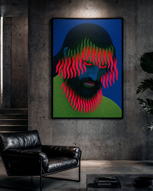


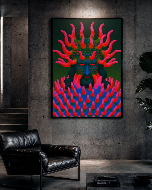

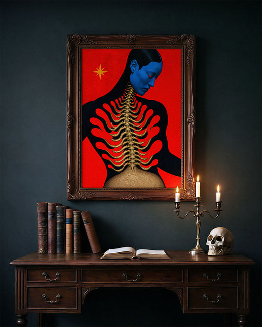


Colourful surreal art prints for people who are done with beige
Explore related realms
-

Art for people who hate minimalism
For people who find minimalism boring, sterile, or just plain uninspiring. This collection...
-

-

Wall art for weird homes
For spaces that feel too clean, too quiet, too normal. This collection is...


